
This article is provided in its entirety by author Jonny Rowntree, a freelance writer with litho printing partner, Elanders UK. He has worked with various technology and design outlets in the past, including The Next Web and Creative Bloq.
Every day, millions of people across the globe engage in a highly pleasurable activity: perusing the aisles of their favourite bookshop. Sometimes they are seeking that sought-after classic for a friend, or are simply curious about what next literary endeavour they can embark on themselves. But despite how product savvy or detached from the corporate world we believe ourselves to be, we always judge a book by its cover. And this is why leading publishers place high stakes in not only staying true to producing good content that will sell, but by a careful composition of design elements comprise a cover that will catch our eye and entice us to look between the pages.
According to designers, there are a few components which draw a viewer to a book and are also reflective of the content within. This boils down to basic features like cover texture, style of artwork, the images projected, and the text which represents the work within. This is easily the most influential aspect in the bundle – words are the most effective communicator, and achieves instant results as well as long subconscious reflection. They must immediately appeal to the viewer while delivering the required message. Ranging from title, author, publisher, to a few choice quotes – a relatively new innovation signifying the further commercialization of the book aesthetic – the letters that adorn the front cover say everything.
Catering to the Classics
Just take the classic Pride and Prejudice, for example. What this title indicates isn’t merely the name but it also connotes images of passionate period drama, of riveting wit and sentiment, of bold heroines and disgruntled yet endearing bachelors. It’s an established piece recognised by both academics and avid readers, and a good designer will understand how to utilize typography to justifiably give this title dignity and produce eye-catching effects. This can range from a times new roman font set against negative space, or within an elaborate floral pattern which works its way around the cover, popular with hardcover books that are striving for that “vintage” look.
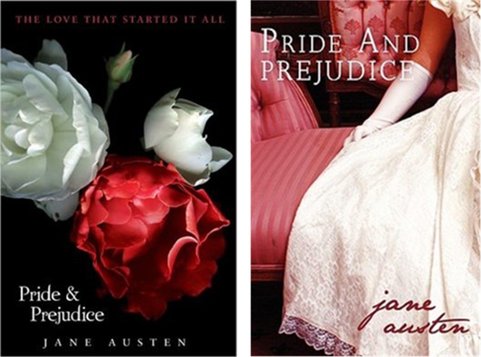
For appealing to a more contemporary audience, Pride and Prejudice also works in cursive for lighter-toned paperbacks in budget and higher-end sections. This suggested genderification appeals to the aspect of the novel which enjoys a large female readership revealing a key market audience. Copyright licenses permit several companies to produce and reproduce various editions of the classics, so to make it a viable competitor there needs to be a degree of reinvention, a feat which publishers like Penguin have mastered. This is where arranging style and text come in handy, as well as the overall quality of the edition itself. Recent years have seen a surge of books in the bargain section improve their cover aesthetic considerably, reviving some stifled old works by simply using a contemporary font – like Calibri or Century Gothic – against a fresh stock imaged background. It works wonders for those who are passing through, or for classics enthusiasts who care about their bookshelves’ presentation.
Choose the Target, then Shoot
What Pride and Prejudice teaches us is that there is still a passion for beloved works that have their eternal place etched into the literary canon, but for newcomers the task at hand can be a little more challenging, which is why typography is an essential part of the marketing package. Striking the balance between established tropes and standing out is a delicate issue – certain genres have their forms by which they are recognised and have a certain etiquette associated with them. While thrillers, mysteries, sci-fi, and more mature content tend to fall into upper case titles, comedy, some works of fantasy, historical fiction, and young fiction – as well as popular travel guides and cookery – use lower case for a lighter tone.
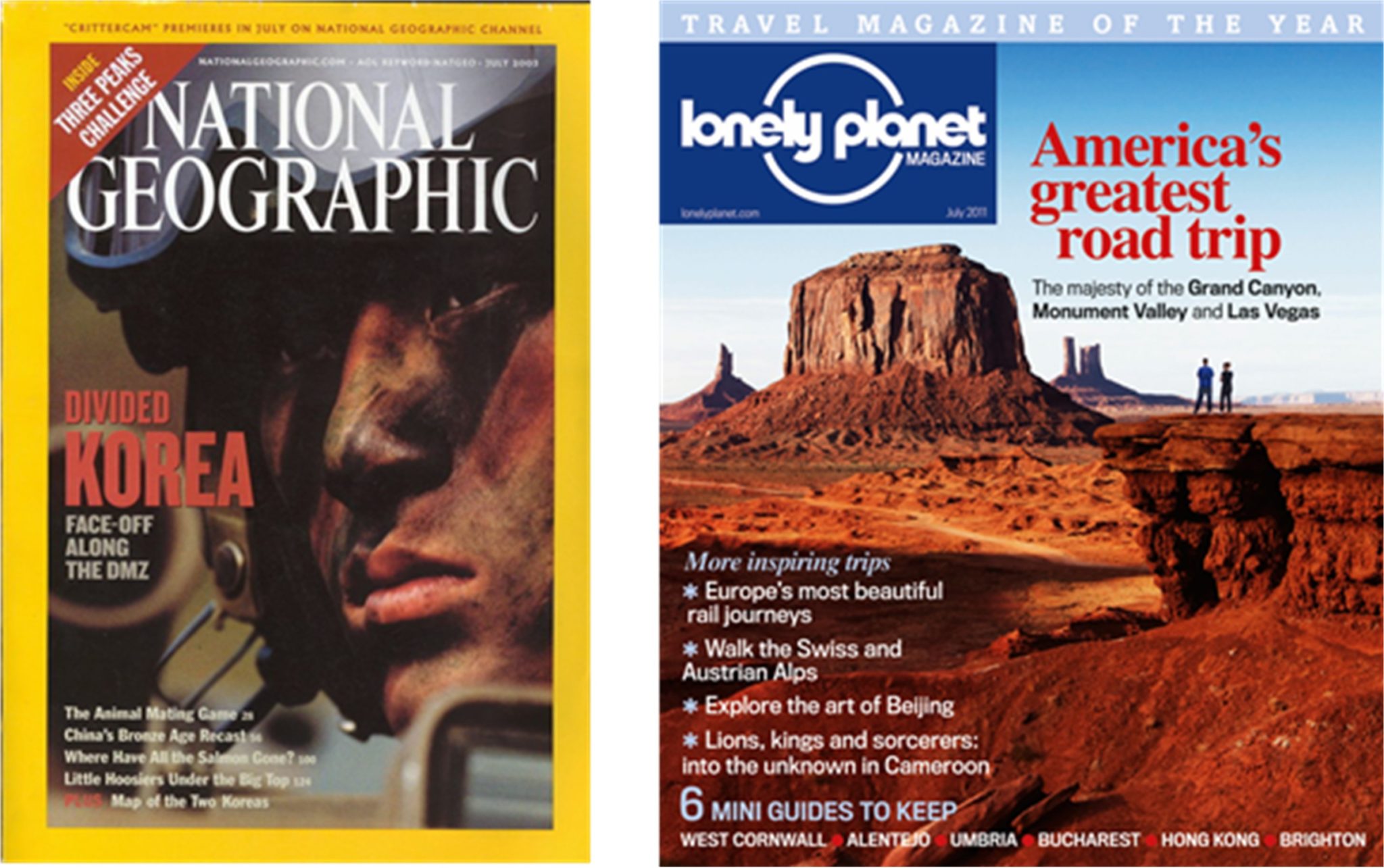
Art, music, and travel is fairly flexible, and the designer decides what level of seriousness or casualness to exude – comparing leading publishers like National Geographic and Lonely Planet can disclose different tones upon second glance, with National Geographic taking on a more intensive, institutionalized tone while Lonely Planet is casual and entertaining, geared towards a broader scope of travelers. This why using particular design tropes is vital for subliminally calling out to the right audiences who will be able to gravitate towards the sections of the bookstore that meet their needs at first glance.
There is a fascinating hierarchy associated with typography too, following a rapid circulation and reprint of bestsellers in particular. Comparing a first edition with a second or third edition of a successful book may see the author’s name overshadow the title itself, because it is the writer who is the focal selling point at this stage. This will happen less frequently in a series where the franchise itself is being advertised, especially where there is a huge merchandise following like Star Wars or Harry Potter.
Creating Appeal Beyond the Bookshelf
With massive increase of resources made available online, it’s not simply about the tactile and visual experience of the bookstore. What marketing on the web indicates is that books must be easily viewed from a thumbnail perspective and capture enough interest to result in a click, especially in the world where devices are getting smaller. Today’s popular designs tend to be minimalistic in nature with a select use of colours and strategically manipulated negative space which helps the words present themselves, and other works may actually integrate the text into the actual design itself which can grab a reader by its artistry enough to draw them into close viewing. Size does matter, and sometimes a small and minimal amount of language set against a poignant focal image is mysterious enough to begin that readerly relationship. At the same time, an instructional book in conventional nature will be basic enough to simply let the reader know what it’s about.
Most importantly, designers need to grasp the integrity of the content they are representing, and make the decision whether or not to wear the book’s substance on its sleeve or leave more to the imagination. An astute understanding of the text and the typography used will ensure that the work is effectively represented as well as marketed. This may involve direct collaboration with the author, illustrator, publisher, and a subconscious dialogue with the public who can tell a serious work from a frivolous one simply by its font. In the best circumstances, engineering the front cover skillfully can produce a brand which will become as unforgettable in the public eye as the core of the work itself.