
Publetariat Editor’s Note: strong language
Over on Jezebel, blogger Tracie Egan Morrissey has got her knickers in a twist over the cover design for the 50th Anniversary re-issue of Syliva Plath’s The Bell Jar. Tracie rants:
If Sylvia Plath hadn’t already killed herself, she probably would’ve if she saw the new cover of her only novel The Bell Jar. For a book all about a woman’s clinical depression that’s exacerbated by the suffocating gender stereotypes of which she’s expected to adhere and the limited life choices she has as a woman, it’s pretty fucking stupid to feature a low-rent retro wannabe pinup applying makeup. (Also, it’s ugly and the colors suck.)

Way to completely miss the subtlety of a very cleverly and thoughtfully -designed book cover, Tracie.
As we all know, book covers are supposed to convey something about the content of the book, whether in terms of plot, setting, tone or character. And they must evoke something about one or more of those things using the visual shorthand of imagery—typically, symbolic imagery. Still with me there, Tracie?
Let’s start with the publisher’s description of the book:
When Esther Greenwood wins an internship on a New York fashion magazine in 1953, she is elated, believing she will finally realise her dream to become a writer. But in between the cocktail parties and piles of manuscripts, Esther’s life begins to slide out of control. She finds herself spiralling into depression and eventually a suicide attempt, as she grapples with difficult relationships and a society which refuses to take women’s aspirations seriously.
The Bell Jar, Sylvia Plath’s only novel, was originally published in 1963 under the pseudonym Victoria Lucas. The novel is partially based on Plath’s own life and has become a modern classic. The Bell Jar has been celebrated for its darkly funny and razor sharp portrait of 1950s society and has sold millions of copies worldwide.
Now, looking back at that cover…is this really just a glam shot of a young, attractive woman tarting herself up, signifying nothing more than ‘girls just wanna have fun and look pretty doing it’? I don’t think so.
First, the background color is a dark red. Not only is it an iconic and representative color for the time period of the novel, but taken on its own, completely out of any context, it’s a symbolically negative color that evokes obstacles, conflict and high energy. Red means stop. “Seeing red” means anger. Red is the color used all over the world on warning signs. Red is also the color of blood, and therefore the color most associated with violence. So the background color should clue the viewer in right away on a gut level: this is not a happy book, you have been warned.
Next, look at the model’s pose and facial expression. She is not smiling, and if anything, the corners of her mouth are downturned. She’s touching up her make-up, but she doesn’t look too happy about that. Actually, her reflection in the mirror shows an expression with downturned mouth that looks more like disgust than anything else. And since the woman is looking at herself, wouldn’t this mean she’s disgusted with herself, and/or with this female obligation to be pretty at all times and at all costs?
And how about that compact? Notice how it completely dominates the image? How it’s front and center, shown in its entirety, while our heroine is only partially visible and off to the side? What message does this convey about the industrial beauty complex versus an individual woman? Also notice – the compact’s red color is being cast downward, partially enveloping the woman’s hand and arm. What does that say about this woman’s relationship with beauty standards and rituals? Could it be that she feels she’s being obscured or overshadowed by them?
Finally, how about the font? Notice how the lines are uneven and spidery, that none of the lines of text are level, and how the text very subtly angles increasingly downward with each line.
Now consider the pre-existing cover designs for this book, in paperback, hardcover and Kindle formats:
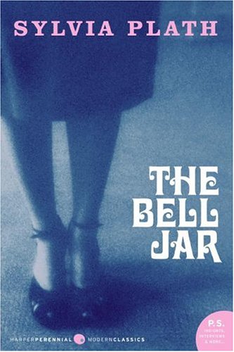

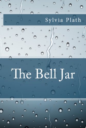
Do any of these covers say anything at all about the content of the book? The first one clues you in that it’s about a woman, but that’s it. The second (the 25th anniversary re-issue cover, BTW) looks more like the cover of a romance novel than a semi-autobiographical account of feminist rage and depression. I guess the rain on the third one symbolizes depression, but that’s all it says. Maybe if you saw all three of them together, you’d get some idea of the content. But as standalones, they don’t hold a birthday candle to the 50th anniversary redesign.
Apparently Tracie would’ve preferred a more literal, hit-you-over-the-head cover, perhaps showing a hot mess of a woman slashing her wrists. But wouldn’t an image like that 1) be a spoiler 2) be a tough sell and 3) overpower the book’s feminist message?
2/7/13 Updated to add: Now THIS is a crime against lit – Anne of Green Gables made over into a blonde farm tart on the cover of a self-pub edition snagged from public domain content http://ht.ly/hvSam
This is a reprint from April L. Hamilton’s new site, The Digital Media Mom.