Skip to content
Publetariat
  • Home
  • About
  • Book Trends
  • Business End
  • Contact
  • Design
  • Ebooks
  • Sell
  • Think
  • Write

Design

Articles about book and cover design, as well as design as it touches on aspects of author platform.

Quick Link: Should Indie Authors Put Endorsement Quotes or “Puffs” on Self-published Books?

April 24, 2017 by Publetariat

Quick links, bringing you great articles on writing from all over the web.

I am one of those people who actually read the endorsement quotes. There are some that are too short to really tell you anything about the book, and I generally ignore those. The quotes with a little substance can tell you a lot about what the reader liked about the book and if it is something you would like too. “Action packed thrilling romance that will keep your heart pounding” is way different from “a sweet romance that will melt your heart and have you believe in true love again”. At the Alliance of Independent Authors, blog editor Debbie Young has gathered opinions and wisdom to help you get all sides of this issues.

~ * ~

Should Indie Authors Put Endorsement Quotes or “Puffs” on Self-published Books?

By Debbie Young

As authors of self-published books, we seek to combine the best ideas from trade publishing with the innovation that comes of being truly independent. But it’s not always easy to decide which conventions to echo and which to reject. One example is the common practice among the big publishing companies to adorn book covers with endorsements from high profile readers.

Skeptics term these glowing phrases “puff quotes” to pour scorn on their sincerity, when so many of them come from “celebrities” – people famous for being famous, rather than for their literary judgment. A cynic might wonder how they find the time to read so much. On the other hand, endorsements, used wisely, can  be genuinely add sales appeal to the cover of any book.

Currently dithering “to puff or not to puff” on the cover of my new mystery novels, I asked ALLi authors whether they thought soliciting endorsement quotes was worth the time and trouble.

Read the full post on Alliance of Independent Authors

~ * ~

If you liked this article, please share. If you have suggestions for further articles, articles you would like to submit, or just general comments, please contact me at paula@publetariat.com or leave a message below.

Save

Save

Share this:

  • Click to share on X (Opens in new window) X
  • Click to share on Facebook (Opens in new window) Facebook
  • Click to share on Reddit (Opens in new window) Reddit
  • Click to share on Pinterest (Opens in new window) Pinterest
  • Click to share on LinkedIn (Opens in new window) LinkedIn
  • More
  • Click to email a link to a friend (Opens in new window) Email
  • Click to print (Opens in new window) Print
Categories Book Trends, Design, Marketing, Publishing Tags Endorsement Quotes, Puffs

Quick Links: Top Five Ways to Have an Awful Book Cover

January 31, 2017 by Publetariat

Quick links, bringing you great articles on writing from all over the web.

I see a lot of book covers during my day job and I can tell with one look who created their own book cover. It makes a huge difference in getting your potential audience to look at your book. So when I found this post by K.S. Brooks at Indies Unlimited I knew I found a kindred spirit. My personal pet peeve is #3 because very long titles make it very difficult to create sponsorship posts that look nice.  What are your hints for good book covers?

~ * ~

Top Five Ways to Have an Awful Book Cover

by K.S. Brooks

I’m constantly looking at book covers as part of my “job” here at Indies Unlimited. On top of that, I run into authors posting their covers in groups all the time, asking for input. So I see a LOT of covers. And most of them all have the same issues.

What I find most ironic is that the same people keep posting book covers with the same problems. I don’t get that. Please allow me to make something perfectly clear. And I’m not just making this up to be difficult or bossy or right. I’m speaking from experience. I used to provide my own cover art to my small Indie publisher – and because of that, I’ve taken some lumps. But I’ve also learned some important things about book covers. I share this knowledge freely, to help my fellow Indie authors. Book covers are important. We all want to make a good first impression. Book sales count on it.

But I’ve noticed that a lot of people don’t want to listen to my advice, but, silly me, I keep giving it in hopes that I can help someone, maybe… someday. What would happen if I started advising them to do the exact OPPOSITE of what should be done? Do you think maybe THEN they’d do the opposite just out of spite and end up with a decent cover? How about we give it a try? With that in mind, here are my top five tips for better book covers.

Read the full post on Indies Unlimited

~ * ~

If you liked this article, please share. If you have suggestions for further articles, articles you would like to submit, or just general comments, please contact me at paula@publetariat.com or leave a message below.

Share this:

  • Click to share on X (Opens in new window) X
  • Click to share on Facebook (Opens in new window) Facebook
  • Click to share on Reddit (Opens in new window) Reddit
  • Click to share on Pinterest (Opens in new window) Pinterest
  • Click to share on LinkedIn (Opens in new window) LinkedIn
  • More
  • Click to email a link to a friend (Opens in new window) Email
  • Click to print (Opens in new window) Print
Categories Design, Marketing, Think Tags Book Covers, marketing, tips for success

Quick Links: Breathe! The Copyeditor Has Your Back

January 10, 2017 by Publetariat

Quick links, bringing you great articles on writing from all over the web.

One of the most important things you can do as an indie author is hire professionals to help you. According to author and freelance editor, Dario Ciriello one of the best choices is a good copyeditor. Read Dairo’s post at Janice Hardy’s Fiction University and see if you agree. 

~ * ~

Breathe! The Copyeditor Has Your Back

By Dario Ciriello

Part of the Indie Author Series

One of the things a good copyeditor will do, beyond dealing with infelicities of grammar, syntax, style, composition, and general meaning, is cover your back. And I mean totally cover it.

In my experience, what most indie authors require is actually a combination of line, copy, and general editing1, not least because the cost of the several editing passes a big publishing house would do (general/developmental edit, line edit, copyedit) can add up to several thousand dollars, a prohibitive cost for the vast majority of indies.

When editing a manuscript for an indie client, the copyeditor is in a watchful mode, consciously noting and monitoring a broad swath of detail and information. The characters’ physical characteristics, the revealed details of their backstories, geographical locations, dates and times events take place, even character names—all these are prone to inconsistency and slippage over the course of a long work and revisions, and it’s the copyeditor’s job to spot these errors and fix them. But that’s just the beginning.

A copyeditor takes little for granted. If, say, I find a reference to a company called Datavision in the text, my first instinct is to wonder if it might not be styled DataVision, or Data Vision, and I’ll google it right away to see if a correction is needed. If I’m working on a science fiction novel and the author states that the universe is 13.8 billion years old, I’ll check that this figure is current and correct—science and tech are especially tricky, since our knowledge is increasing at such a rate that “facts” are constantly changing.

Read the full post on Janice Hardy’s Fiction University

~ * ~

If you liked this article, please share. If you have suggestions for further articles, articles you would like to submit, or just general comments, please contact me at paula@publetariat.com or leave a message below.

Share this:

  • Click to share on X (Opens in new window) X
  • Click to share on Facebook (Opens in new window) Facebook
  • Click to share on Reddit (Opens in new window) Reddit
  • Click to share on Pinterest (Opens in new window) Pinterest
  • Click to share on LinkedIn (Opens in new window) LinkedIn
  • More
  • Click to email a link to a friend (Opens in new window) Email
  • Click to print (Opens in new window) Print
Categories Business End, Design, Think Tags Copyeditor, Quality

Quick Link: Checklist for redesigning your book cover – and maximising the marketing opportunities

September 5, 2016September 5, 2016 by Publetariat

Quick links, bringing you great articles on writing from all over the web.

Fair or not, people will judge your book by it’s cover, and if it has been a while since you looked at your cover perhaps it is time for a refresh. Roz Morris at Nail Your Novel has some great reasons why you should redesign your book cover and tips to make the redesign work even harder for you.

~ * ~

Checklist for redesigning your book cover – and maximising the marketing opportunities

The key to good design, is to know what you are doing. Hiring a professional is a good investment.

I recently changed the covers of my Nail Your Novels … and got myself a nice long to-do list as a result. But as well as refreshing the look of the books, a redesign is also a chance to smarten up the covers’ marketing potential. Here’s how.

Don’t miss the opportunity to tweak your sales wording

I’ve already blogged about changing the cover design to target readers effectively (the last time I changed the cover of book 1, as it happens). But revising the book doesn’t have to stop at the visuals. Since you published the title, have you had any standout reviews? Work them into the redesign – on the front as a teaser or the back as part of the sales blurb.

Indeed, could you add punch to the back cover copy?  Sometimes reviewers sum up our books much better than we can ourselves. A reader who really got the book might have written you a brilliant logline. Search your reviews in case.

If you have an ‘about the author’ paragraph on the back, should you update it? Perhaps you’ve published more books, or won a prestigious award.

What about your author photo? My Nail Your Novels had three different author photos according to the years they were published (and the hue of my hair), but with this reboot I decided to use a new image to make them look more current and uniform.

I also found I had room on the back for miniatures of the other books in the series – a good visual way to let readers know they’re part of a set.

Read the full post on Nail Your Novel

~ * ~

If you liked this article, please share. If you have suggestions for further articles, articles you would like to submit, or just general comments, please contact me at paula@publetariat.com or leave a message below.

Share this:

  • Click to share on X (Opens in new window) X
  • Click to share on Facebook (Opens in new window) Facebook
  • Click to share on Reddit (Opens in new window) Reddit
  • Click to share on Pinterest (Opens in new window) Pinterest
  • Click to share on LinkedIn (Opens in new window) LinkedIn
  • More
  • Click to email a link to a friend (Opens in new window) Email
  • Click to print (Opens in new window) Print
Categories Design, Marketing Tags Cover redesign, marketing

Quick Links: How to Prepare for Self-Publishing: Ebook Formatting

August 9, 2016 by Publetariat

Quick links, bringing you great articles on writing from all over the web.

This is the next in a series of posts about self-publishing from Digital Publishing News. Catherine Dunn talks about some basic formatting hints and things to look out for. If you have a question or problem with preparing your manuscript for eBook publishing, let me know in the comments below and perhaps I can help.

~ * ~

How to Prepare for Self-Publishing: Ebook Formatting

By: Catherine Dunn
June 8, 2016

This is part three of a six-part series.

Not an acceptable Amazon file format.

You’ve got your finished manuscript in Microsoft Word and you’re ready to turn it into an ebook. You need to convert it into MOBI format (for Amazon Kindle) and EPUB (for everywhere else). There are various companies, tools and programs that can convert your file for you, but how can you make sure it ends up looking right? You already know that ebooks behave quite differently from Word documents, so how can you be confident that your carefully crafted file will work as an ebook?

Keep it simple

Don’t forget that most ebooks—unless you’re specifically opting for a fixed format to handle lots of illustrations, charts, tables, etc.—are reflowable, which means that the reader can choose the size of the text and some other elements like font, line spacing and margins. So your careful choice of 12 point Palatino won’t always render exactly as you envisaged. By keeping the formatting as simple as possible, you reduce the risk of introducing anything that will be too distracting to the reader. After all, you want her to focus on what you’ve written, not on what it looks like.

Before you submit your book for conversion, there are a few really basic things you can do within Word to make it look more professional.

Switch on the “Show nonprinting characters” option—click the button that looks like this: Show nonprinting characters

This displays the formatting marks, showing all the formatting you’ve used: spaces, line breaks, paragraph breaks, tabs, page breaks—the works. This makes it easier to see what you’ve done and will help you to strip out extraneous formatting.

Remove rogue spaces from the beginnings and ends of paragraphs. This can be a tedious job, but it’s worth it, because extra spaces often stand out on an e-reader.

Read the full post on Digital Publishing News

~ * ~

If you liked this article, please share. If you have suggestions for further articles, articles you would like to submit, or just general comments, please contact me at paula@publetariat.com or leave a message below.

Share this:

  • Click to share on X (Opens in new window) X
  • Click to share on Facebook (Opens in new window) Facebook
  • Click to share on Reddit (Opens in new window) Reddit
  • Click to share on Pinterest (Opens in new window) Pinterest
  • Click to share on LinkedIn (Opens in new window) LinkedIn
  • More
  • Click to email a link to a friend (Opens in new window) Email
  • Click to print (Opens in new window) Print
Categories Design, Ebooks, Publishing Tags ebooks, Formatting, self-publishing

In The News – 50 Best Covers

August 5, 2016 by Publetariat

In The News – Articles Of Interest For Authors

Don’t you always like to peek and see what other people are doing? At the Design Observer Group they have their 2015 cover winners. I have to admit that my favorite is “Between You & Me Confessions of a Comma Queen” because it is clever, has great design, but also really conveys what the story is about. Which is your favorite?

~ * ~

covers

Read the full post on Design Observer Group

~ * ~

If you liked this article, please share. If you have suggestions for further articles, articles you would like to submit, or just general comments, please contact me at paula@publetariat.com or leave a message below.

Share this:

  • Click to share on X (Opens in new window) X
  • Click to share on Facebook (Opens in new window) Facebook
  • Click to share on Reddit (Opens in new window) Reddit
  • Click to share on Pinterest (Opens in new window) Pinterest
  • Click to share on LinkedIn (Opens in new window) LinkedIn
  • More
  • Click to email a link to a friend (Opens in new window) Email
  • Click to print (Opens in new window) Print
Categories Business End, Design, News Tags Book Covers

Author Websites: Part Two – Hosts With The Most!

January 26, 2016 by Publetariat

In Part One of Author Websites – The Domain Name Game! we talked about buying a domain. The next step is deciding what type of host to use that works for your particular situation. Below you find the different options with the pro and cons of each.

Robot with WWW sign. Website building or repair conceptSocial media pages
Examples – Facebook, Instagram
Pros – free and hey social media, that’s cool right?
Cons – harder to share with other social media, harder to customize, not as professional.

With so many different social media options out there, which one should you choose? Don’t waste your time on the latest and greatest hot new site or app. Your goal is to get people to notice and hopefully buy your book. New platforms take time to become mainstream or they fail and all your hard work is wasted.

Unless your book has a lot of pictures or is about photography you will probably want to stay off sites like Instagram or Pinterest as your main contact point. Twitter is a great tool for marketing but not really designed to be an author page. Which leaves Facebook.

While Facebook is trending for older users, it is still a force to be reckoned with. With over 1.55 billion users in fall of 2015, that is a lot of action. The ability to create a book or author page where you can post updates and interact with your fans makes this a winner.

The downside to having a social media page for your author site is it is much harder to control, and to share with other sites. This doesn’t mean you shouldn’t have a Facebook site, Twitter account, or other social media as part of your marketing strategy. What most professional people have is a website/blog that acts as a center hub to promote out to social media. However, if you are a one-time author and low on funds, this is as easy and quick as they come.

Platform hosts
Examples – Blogger, WordPress.org
Pros – easy to set up, low cost, often free
Cons – doesn’t look as professional, your domain url will end with their platform name. For example instead of authorname.com you would have authorname.wordpress.com. Harder than a Facebook page to set up and maintain.

This is definitely a step up from having a social media page for an author site. You are able to create content and interact with people, while having a main hub to post to social media from. There are a bunch of free themes and plugins to help.

Side note on free themes and plugins. Beware, you get what you pay for. Often programmers who are starting out will give away items because they are not established in the marketplace yet. This means that the free stuff might not be well written, have security issues, and are rarely updated. There are exceptions to this, and a good way to tell is to see how many people have downloaded or used the item. People have to make money somehow and if they can’t, they disappear to do something that will make them money. Even paying .99 cents for theme brings the quality up massively. Your .99 cents plus a couple of thousand other people’s .99 cents adds up to a normal amount for a solid theme or plugin.

While this is a step up from a Facebook page, it can be more technical. If you are not comfortable with technology, then you might want to get help just to get set up. But if you are going to do that, then you might as well get your own site, as explained in the next example. Once your site is set up, then it is much easier to update. If you can use MS Word, then you can write a post.

Shared hosting
Examples – HostGator, Blue Mountain, etc.
Pros – your own domain, domain email, very professional
Cons – costs a little money depending on your preferences, and can be harder to setup

This is the most professional of the options. You have your own customized url, your own host that you control the look and feel of, and professional emails. This is also a little more difficult to set up so don’t hesitate to ask for help from your host provider or hire someone to help you. Most hosts have one step WordPress install features or will gladly install a WordPress site for you for free or a small fee.

Once you have WordPress installed it is very similar to the platform host setup, where you can use plugins and themes to customize your site. Please see the side note above on plugins.

The best way to pick a good host is to open your search engine, such as google, and type “top rated web hosting”. Go through the links on the first page of your search results. You will start to see some names show up again and again on the different rated lists. Write down the top three names you see the most, look at their sites and pick the one you like. Don’t pick a host based on their super bowl commercial. You will be setting yourself up for a world of hurt.

Costs vary on hosting, but most places will have a sale going on at the time of purchase. Lucky you! Don’t buy more than you need, a basic package is usually good enough for a starter site, and if you need to upgrade, your host will be happy to provide assistance.

Self Hosting
Examples – server in your garage, Amazon cloud
Pros – complete control
Cons – costs a lot more money and needs a lot more technical skills, especially dealing with security issues.

Unless you already have good tech skills, this option is more than most people will need and is beyond the scope of this article. Seriously, this is for the big boys who don’t need to read articles like this and have paid minions.

So there you have the different hosting types broken down so you can decide what is right for you. The next article in the series will be a step-by-step process to set up a customized Facebook page.

~ * ~

If you liked this article, please share. If you have suggestions for further articles, articles you would like to submit to be posted on this site or just general comments, please contact me at paula@publetariat.com

Share this:

  • Click to share on X (Opens in new window) X
  • Click to share on Facebook (Opens in new window) Facebook
  • Click to share on Reddit (Opens in new window) Reddit
  • Click to share on Pinterest (Opens in new window) Pinterest
  • Click to share on LinkedIn (Opens in new window) LinkedIn
  • More
  • Click to email a link to a friend (Opens in new window) Email
  • Click to print (Opens in new window) Print
Categories Business End, Design, Marketing Tags author website, book selling, Domains, marketing

Author Websites: Part One – The Domain Name Game!

January 3, 2016December 7, 2015 by Publetariat

Now that you have decided to create your own author website, the first step is figuring out what your domain name is going to be. Even if you plan on hiring someone to do most of the heavy lifting for you, it is good to understand the process.

According to Wikipedia, a domain name is “an identification string that defines a realm of administrative autonomy, authority or control within the Internet.” Yea. If that made sense to you, then congratulations, you don’t need this article. In plainer words, it is what people type in their browser to pull up your site.Robot with WWW sign. Website building or repair concept

As discussed in the post What is in a name? Everything if you are an author. Why you need your own author site, the best choice is to use your author name if you can. To find out if it is available, you can go to one of the many domain search engines on the web. I personally like namecheap.com. I am not getting paid in anyway to promote them, I just like them. Feel free to use whomever you want.

If your author name is not available, consider adding extra words to your name such as “author” or “books”. For example AuthorJoeName.com, or JoeNameBooks.com. If you are blessed with a heritage that leans towards long and unpronounceable last names, go ahead and shorten it to something that is easily type-able. Anastasios Papademetriou from high school, I am talking to you. You want to make it easy for people to find you.

The nice thing about these search tools is they will offer you suggestions if your desired domain name is already taken. Beware, they will often show you your domain name with other available domain extensions like .biz. Don’t waste your money. Really, when most people search they will be going by a .com name. If you buy the .club, .biz, or any of the other options, the .com is what people will find first. You will be spending your time trying to educate people about how the yourname.com is not you. The only exception would be if you are writing on behalf of a charitable organization, then the .org could be used or if you are writing x-rated material, then the .xxx is perfect for you.

So you found your domain name is available. That is awesome! While you are looking, go ahead and see if your book title is free too. You can always have more than one domain redirect to one site. So for example, you could have AuthorJoeName.com, JoeNameisreallylong.com, and Joenamebook.com all end up at the website AuthorJoeName.com. (I will go into this in later posts!)

So now you are ready to purchase! You can either purchase from the place where you did the search, or sometimes you can go through the web host. I will have more on that next week’s post – Author Websites:  Part Two – Hosts With The Most! A lot of web hosts will also allow you to purchase domain names, and even help you set things up.

A side word on “Whoisguard”.  Whoisguard is a service that blocks the public display of your domain registration information.  To register your domain, you need to provide personal information including your name and address, things you don’t want to be public. When you go to purchase your domain, you might be offered Whoisguard for a year free, or for purchase for a few bucks more. Do yourself a favor and get the Whoisguard.

~ * ~

If you liked this article, please share. If you have suggestions for further articles, articles you would like to submit to be posted on this site or just general comments, please contact me at paula@publetariat.com

Share this:

  • Click to share on X (Opens in new window) X
  • Click to share on Facebook (Opens in new window) Facebook
  • Click to share on Reddit (Opens in new window) Reddit
  • Click to share on Pinterest (Opens in new window) Pinterest
  • Click to share on LinkedIn (Opens in new window) LinkedIn
  • More
  • Click to email a link to a friend (Opens in new window) Email
  • Click to print (Opens in new window) Print
Categories Business End, Design, Marketing Tags author website, book selling, Domains, marketing

What is in a name? Everything if you are an author. Why you need your own author site.

January 3, 2016November 23, 2015 by Publetariat

Have you ever googled your own name? You should. It is interesting to see what comes up. If you are an author what shows up when a fan or agent searches for you is pretty important. If you write, you need an author site.

Why an author site instead of a book site? With the focus on you as an author, instead of the individual book, you have room to grow. Each book can have its own landing page or subdomain under your author site. Fans want to get to know the author behind their favorite books. Read on for the reasons why you need your own author site.Web Design Puzzle Shows Website Content And Creativity

  • Shows you are legit
    There are a thousand new books being created each day. To stand out, especially from the “do-it-yourself-quick” crowd, you want to present as a professional author. Having a good looking site with well written content sets you apart. Agents and fans often google peoples names. To be the first result that pops up in a Google search is reason enough to have you own author site.
  • Social Media Anchor point
    Social media is more powerful with a website, and an author website is more powerful with social media. It is a symbiotic relationship. Managing multiple social media outlets is much easier from a central website. In fact, there are plugins and options that will automatically post to social media for you, especially if you use WordPress or other content management systems.From your author site you can post to Facebook, tweet to Twitter, pin on Pinterest, or whatever your social media flavor is, while keeping a consistent message. Promoting from Facebook or Twitter to another platform is much harder. Which makes sense if you think about it. Each social media site was set up for a different niche.  Facebook allows images but is more chatty. Twitter is text less than 140 characters. Pinterest and Instagram are more image driven. So you might not get as much traffic on your site as on your social media outlets, but having a website will make your life easier and will drive traffic through the social media sites. Plus not everyone is on social media, so it is good to have a place for them as well.
  • Control
    An author’s site is their castle. You get to decide what goes on your site, and you are not restricted by Amazon or anyone else’s policies. In fact they will all have a place where you can put a link to your author site!There are so many cool options that you can provide on your own site. If you want to provide a free chapter you can. You can have press kits, media kits, official author bios, event listings, book club materials, testimonials, whatever you want. Sell your book off your own site and keep every precious penny!While this might seem overwhelming, having this freedom and control over your message is a beautiful thing. So guard it well and don’t fret. There are plenty of articles out there to help guide you. Start small and then grow.
  • Connections
    This is what it is all about really. You wrote down words with the hopes that they would connect with someone, hopefully with many someones. The someones are going to want to connect back to you. The author site is about you, and because you have control over your site, you can manage how your fans interact with you. Interactions vary from providing a simple bio where you fans can learn carefully scripted information about you, to interacting directly with your fans through comments or even forums.You can set up your site to collect emails. Emails are golden! Having someone decide that they like you enough to take the action of filling out a form and trusting you with their contact information is a wonderful thing. This is a very targeted audience, no matter how small. Make sure you treat people’s emails with the respect they deserve. Offer them extra treats for being so cool, like bonus chapters, or even to be a focus group for your next book!

Of course creating an author website is not the end, you will need to set aside time for updates and maintenance. Updated content keeps the search engines happy. While this sounds like a lot of work, a good author site will be a solid foundation for your overall market strategy and it can be a load of fun too.  In future articles, we will dive deeper in the process of creating an author website: how to create one, what you need on your author website, more on social media, and tools and tricks to help.

~ * ~

If you liked this article, please share. If you have suggestions for further articles, articles you would like to submit, or just general comments, please contact me at paula@publetariat.com

Share this:

  • Click to share on X (Opens in new window) X
  • Click to share on Facebook (Opens in new window) Facebook
  • Click to share on Reddit (Opens in new window) Reddit
  • Click to share on Pinterest (Opens in new window) Pinterest
  • Click to share on LinkedIn (Opens in new window) LinkedIn
  • More
  • Click to email a link to a friend (Opens in new window) Email
  • Click to print (Opens in new window) Print
Categories Business End, Design, Sell, Think Tags author website, Authors Social Media, marketing, SEO

Secrets of the Book Designer: Paperbacks

January 3, 2016November 11, 2015 by Publetariat

Today’s post by Linda Huang originally appeared on Literary Hub on October 22, 2015.

~ * ~

Secrets of the Book Designer: Paperbacks

On Creating the Paperback Edition of Dept. of Speculation

THE DAY JOB

I’m a cover designer at Vintage & Anchor Books, the paperback imprint at the Knopf Doubleday Publishing Group. On average, roughly half our covers are adapted from the hardcover design, and the rest are entire redesigns. Whether or not a book needs a facelift depends on a number of factors, including (most importantly) hardcover sales, the hardcover design’s commercial accessibility, and its reproducibility in paperback. The goal of the paperback is therefore to reposition a book, capture a wider audience, or target a new market. We give books a second chance.

What this means visually is democratizing the design: making it appeal to more readers by showing more of a sense of place, time, character, genre, or mood. Generally, hardcovers can afford to be a bit abstract while paperbacks prefer to be more concrete. Although this can sometimes result in graphic sameness, readers do need cues to help them decide what to buy. The goal is, after all, to sell books. The internal struggle as a designer, then, is finding a satisfying balance between commercial accessibility and artistic standards. We try to push boundaries to create covers that are graphically interesting—which has a pragmatic purpose because it helps them stand out—while maintaining a level of marketability.

Before I begin work, I read as much as I can of and about the book and author—reviews, marketing strategies, and similar titles, jotting down anything I find metaphorically significant or visually interesting. If necessary, I collect art research for inspiration, especially for era-specific books. It helps to have a mood board containing the visual language I am trying to capture. I then ask myself:

What is the overall tone or mood of the writing?

Does it call for a photograph, an illustration, or a collage?

Is the author important enough to warrant an all-type cover?

I design as many iterations of a cover as necessary until I am happy with at least a few directions. My art director might make suggestions or help me narrow it down even further to present to the committee, who then select one to be sent to the author for approval. All this communication is handled through the editor. Unless you have a relationship with the author, designers rarely interact with them in the design process.

Read the full post on Literary Hub.

Share this:

  • Click to share on X (Opens in new window) X
  • Click to share on Facebook (Opens in new window) Facebook
  • Click to share on Reddit (Opens in new window) Reddit
  • Click to share on Pinterest (Opens in new window) Pinterest
  • Click to share on LinkedIn (Opens in new window) LinkedIn
  • More
  • Click to email a link to a friend (Opens in new window) Email
  • Click to print (Opens in new window) Print
Categories Book Trends, Design Tags book design, cover, paperbacks

Create A Compelling Book Title

January 3, 2016October 21, 2015 by Publetariat

This post by Rachelle Gardner originally appeared on her site on 9/17/15.

I’ve been coaching several of my clients through the process of coming up with a good title for their book, so I thought I’d share my tips with you.

Let’s start by acknowledging a few things. The publisher is usually responsible for the final decision on title, and in the query stage, it’s not that important. In fact, some agents have said they don’t pay any attention at all to titles. But at some point, you’re going to want to think seriously about this. Your title is part of the overall impression you’re creating about your book. It can set a tone and create an expectation. Whether you’re pitching to an agent, or your agent is pitching to publishers, I think you want to have the strongest title possible.

Think of it this way: the better your title is, the better your chance that the publisher will decide to use it, rather than changing it.

So here’s what I recommend when you need a title, for either fiction or non-fiction.


Read the full post on Rachelle Gardner’s site.

Share this:

  • Click to share on X (Opens in new window) X
  • Click to share on Facebook (Opens in new window) Facebook
  • Click to share on Reddit (Opens in new window) Reddit
  • Click to share on Pinterest (Opens in new window) Pinterest
  • Click to share on LinkedIn (Opens in new window) LinkedIn
  • More
  • Click to email a link to a friend (Opens in new window) Email
  • Click to print (Opens in new window) Print
Categories Business End, Design, Think, Write Tags book marketing, book title, genre, how to choose a title

A Glossary Of Typographic Terms

January 3, 2016September 24, 2015 by Publetariat

This post by Janie Kliever originally appeared on Canva on 7/20/15.

The world of typography often seems like it has its very own language, full of serifs, strokes, and swashes.

Sorting out all those terms can be confusing in itself, so we’ve compiled a visual glossary that will guide you through the lingo — whether you’re an aspiring typeface designer or just a general typography enthusiast. Learning the building blocks of typography will help you better understand how to pick a suitable font and apply it effectively within your design projects.

typography-terms-infographic

The Basics: Typefaces Categories & Styles

01. Font/Typeface:

typography-terms-1

Back in the days of metal type and printing presses, fonts and typefaces were two different things — the typeface was the specific design of the letters, say Times New Roman or Baskerville; while the font referred to the particular size or style of that typeface, say 10 point regular or 24 point italic (each created as its own collection of cast metal letters and other characters). Today, however, many designers use the terms more or less interchangeably. The best and most straightforward modern definition I’ve run across (courtesy of Fontshop) goes as follows:

“A collection of letters, numbers, punctuation, and other symbols used to set text (or related) matter. Although font and typeface are often used interchangeably, font refers to the physical embodiment (whether it’s a case of metal pieces or a computer file) while typeface refers to the design (the way it looks). A font is what you use, and a typeface is what you see.”

02. Character:

typography-terms-2

An individual symbol of the full character set that makes up a typeface; may take the form of a letter, number, punctuation mark, etc.

03. Alternate Character / Glyph:


Read the full post, which includes many more graphics, on Canva.


Share this:

  • Click to share on X (Opens in new window) X
  • Click to share on Facebook (Opens in new window) Facebook
  • Click to share on Reddit (Opens in new window) Reddit
  • Click to share on Pinterest (Opens in new window) Pinterest
  • Click to share on LinkedIn (Opens in new window) LinkedIn
  • More
  • Click to email a link to a friend (Opens in new window) Email
  • Click to print (Opens in new window) Print
Categories Design Tags book design, book layout, design, fonts, history of type, typography

On Changing Book Titles And Covers: My Own Experience And How You Can Do It Too

January 3, 2016June 24, 2015 by Publetariat

This post by Joanna Penn originally appeared on her The Creative Penn site on 4/28/15.

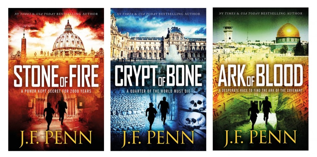
I’ve just been through a massive rebranding process: re-titling and re-covering the first 3 books in my ARKANE series, and updating the back matter for all the other books.

A hefty amount of work!

Here’s why and how, just in case you want to go through this sometime. It’s quite a long, confessional style of post. I’m ‘fessing up to my mistakes, so be gentle with your comments!

First up, here are the awesome new covers: Stone of Fire (previously Pentecost), Crypt of Bone (previously Prophecy) and Ark of Blood (previously Exodus), designed by the wonderful JD Smith Design.

New ARKANE covers

So, why change my fiction book titles anyway?

Basically, none of us know what the hell we’re doing when we start writing  🙂

Here’s how my first book title journey went.

In November 2009, I joined NaNoWriMo in an attempt to write something fictional. Amusingly, I videoed the process – here’s Day 1, and you can follow the whole journey here. The working title for the book on Day 1 was Morgan – and Morgan Sierra is still the name of my main character and alter-ego, so that hasn’t changed.


Read the full post on The Creative Penn.


Share this:

  • Click to share on X (Opens in new window) X
  • Click to share on Facebook (Opens in new window) Facebook
  • Click to share on Reddit (Opens in new window) Reddit
  • Click to share on Pinterest (Opens in new window) Pinterest
  • Click to share on LinkedIn (Opens in new window) LinkedIn
  • More
  • Click to email a link to a friend (Opens in new window) Email
  • Click to print (Opens in new window) Print
Categories Business End, Design, Ebooks, Sell, Think Tags author platform, book cover design, branding, genre fiction, rebranding

Kindle’s New Bookerly Font and Other Typography Features

January 3, 2016June 23, 2015 by Publetariat

This post by Joel Friedlander originally appeared on his The Book Designer on 6/22/15.

Many ebook readers—and not just us typography nerds and designers, either—have complained about the limited font set provided with the major e-readers.

Considering the vast sums that have been spent on developing these devices, it’s always seemed odd to me that they would trumpet their e-reading devices and commitment to book readers, then ship a product that aims to fulfill these promises… but only in one of these fonts:

  • Baskerville
  • Caecilia
  • Georgia
  • Helvetica
  • Palatino

I’ve typeset books in Baskerville, but there’s Baskerville, then there’s Baskerville, a sturdy face with high stroke contrast and lovely long serifs, not the weak-tea version on the Kindle.

Now Amazon has put some work into upgrading both the font selection on its Kindle devices and apps, but also on other areas of typography that Kindle has historically fallen down on.

The rollout of these features seems to be happening slowly along Amazon’s product line, and it’s hard to tell which devices have received which upgrades.

On Amazon’s own site for the new Kindle PaperWhite, they list 5 new features:


Read the full post on The Book Designer.


Share this:

  • Click to share on X (Opens in new window) X
  • Click to share on Facebook (Opens in new window) Facebook
  • Click to share on Reddit (Opens in new window) Reddit
  • Click to share on Pinterest (Opens in new window) Pinterest
  • Click to share on LinkedIn (Opens in new window) LinkedIn
  • More
  • Click to email a link to a friend (Opens in new window) Email
  • Click to print (Opens in new window) Print
Categories Book Trends, Design, Ebooks Tags ebook design, ebook fonts, ebook layout, fonts, typography

How to Make Custom Images for Your Blog Posts Without Hiring a Designer

January 3, 2016June 11, 2015 by Publetariat

This post by Neil Patel originally appeared on Quicksprout on 6/8/15.

The posts on this blog are typically 2,000 words long. Would you honestly read them if they were nothing but text? Sure, some of you would (and that’s amazing, thank you), but I could never blame anyone for not wanting to read a giant block of text.

This is why articles that include images get 94% more total views than articles that don’t.

Remember though, that stat is just an average. If you use images well, your traffic could increase even more.

It’s a win-win: you get more pageviews, and your readers get to enjoy reading more digestible content.

While social media isn’t the same as your blog posts, it illustrates the power of great images.

Posts on Facebook that include an image get 53% more likes than posts without an image. Additionally, they also make up 93% of the most engaging posts.


Read the full post, which includes 5 specific tips for making custom images, on Quicksprout.


Share this:

  • Click to share on X (Opens in new window) X
  • Click to share on Facebook (Opens in new window) Facebook
  • Click to share on Reddit (Opens in new window) Reddit
  • Click to share on Pinterest (Opens in new window) Pinterest
  • Click to share on LinkedIn (Opens in new window) LinkedIn
  • More
  • Click to email a link to a friend (Opens in new window) Email
  • Click to print (Opens in new window) Print
Categories Business End, Design, Sell Tags author blog, author platform, DIY, social media
Older posts
Page1 Page2 … Page10 Next →
  • RSS - Posts
  • RSS - Comments

Favorite sites

skrawl.com - a brand new world of collaborative storytelling…

Writer Beware -Shining a bright light into the dark corners of the shadow-world of literary scams


© 2025 Publetariat • Built with GeneratePress
 

Loading Comments...