
Please note that while this article is targeting eBooks, there are still some great tips for print covers. However, print covers are more complicated and will be addressed in a future post.
You are not suppose to judge a book by it’s cover, but that is exactly what people do. In the post Categories, keywords, Amazon, and you. How to get the most out of your choices I showed you how to use categories and keywords to help your book rank higher in Amazon’s search. Now that your book is showing up in front of more potential buyers, you need to make sure you grab their attention. How? With an awesome cover.
You need awesome, because there are a lot of other books competing with yours. You have about 6 seconds to grab potential customer’s attention, and let them know that their next great read is your book.
There is a lot of information that goes into a great cover: color theory, font choices, layout flow, and more. If you can, you should hire a professional. If you can’t hire a professional, don’t use MS Word to create your cover. Use a better program such as Canva, which is free, and will at least give you an option of professional layouts. Either way the tips below will help you.
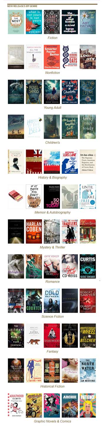 Size – A good cover will look great even in thumbnail size. Readers should still be able to get the gist of the book and at minimum be able to read the title. A lot of dedicated eReaders are in grayscale, so make sure you check that your cover works for them. The ideal height/width ratio is 8:5 (1.6). See the screen capture of the recent book list I got from Goodreads on the right for some examples.
- KISS (Keep it simple silly) – Simple is better, especially if you are designing your own cover. A simple design sizes better and is easier to convey information to the reader. This doesn’t mean your cover needs to be boring, far from it. A simple design can be very powerful. Covers with more details need careful handling, and are best managed by a professional. You don’t want to overpower your reader or loose the essence of your story with too many details.
- Title – Make it stand out. This means good space around the title, a readable font, and a good size.If you have a long title, take the best part and make it the focus. Have the less important parts be, well, less important. For example:
THE AMAZING TRUE STORY OF BELA LUGOSI AND HIS WONDER RACING LLAMAS: PART ONE – BELA LUGOSI IS ALMOST KILLED AS A CHILD BY A RUNAWAY RACING LLAMA (PART 1 IN THE RACING LLAMAS SERIES!)
It is a bit much for a cover. The eye is overwhelmed. Try instead:
The Amazing True Story Of Bela Lugosi
And His Wonder Racing Llamas
Part One – Bela Lugosi Is Almost Killed As A Child By A Runaway Racing Llama
(Part 1 In The Racing Llamas Series!)The bold part is still long, but it gets the title and general story across. The rest can be moved to other areas of the cover, breaking up the text into nice bite size bits. Notice the natural breaks, which happen where there is punctuation. Each section can stand on it’s own.
- Story – Does your cover convey a general sense of what your story is about and the genre? Your graphics should match the mood and fit your story. If your story is a regency romance then having a woman on the cover in a modern slip dress doesn’t fit, no matter how breathless and heaving her bosoms are.
- Invest – Resist the temptation to be cheap. It is OK to want the best value for your dollar, but I guarantee I can spot your MS Word clip-art a mile away and so can potential readers. If you go to a site where you can hire someone cheaply, be aware that they are probably working off a template. Your cover will look a lot like a bunch of other ones. There are places where you can get good images or artwork for a decent price. A true professional will take time to understand your story and make the cover match.
- Image Effects – There are a lot of fun tools you can play with to create rainbow gradients, text outlines, and embossing effects. Go nuts and have fun! Then delete all the effects and put those tools away.
- Color – Most website’s backgrounds are white. So if your background color is white, you will fade away. Even using a few shades different from white will make a big difference. Don’t use a big black frame to fix this.
Your cover will look better if you use color judiciously. This doesn’t mean that you have to use boring colors. If you use colors that are harmonious with each through color theory, it will be more pleasing to the reader’s eye. There are tools that will help you pick out a palette of colors that looks good together. I like the one at Adobe. It is free.
- Fonts – Fonts are like spices. A few mixed together is yummy, too many a disaster. Pick two or at most three that look good together and stay with them. Google Fonts are free and offer a wide variety of choices. Make sure you pick one that matches the mood of your story, but is not so fancy it can’t be read. If you have one “decorative” font, pick a simpler one to match. Avoid Comic Sans or Papyrus like the plague. No seriously, don’t use them – ever.
 Flow – The eyes can only look at so many things at once. Your layout should be set up to guide the reader to the main points you want to convey. You can use position, size of elements, and even your graphics to lead the your reader down the path that communicates your story.
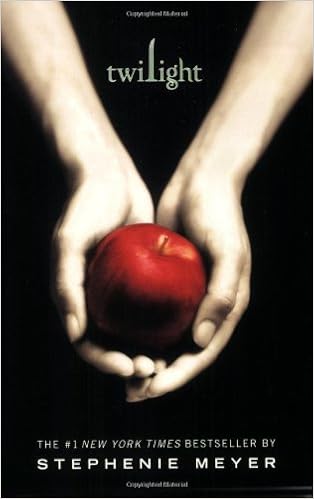
Symbolism can be very powerful. Instead of using a literal part of your story as the cover, use symbols to convey the main point or mood. This attracts your reader but can also leave a little mystery to the reader. No matter how you feel about the story, The Twilight books by Stephenie Meyer, have wonderful covers that use symbolism in a very powerful way.
Flow – The eyes can only look at so many things at once. Your layout should be set up to guide the reader to the main points you want to convey. You can use position, size of elements, and even your graphics to lead the your reader down the path that communicates your story.
Symbolism can be very powerful. Instead of using a literal part of your story as the cover, use symbols to convey the main point or mood. This attracts your reader but can also leave a little mystery to the reader. No matter how you feel about the story, The Twilight books by Stephenie Meyer, have wonderful covers that use symbolism in a very powerful way.- Review – Have someone you trust look at your cover. Someone who will tell you the truth. Then get a second opinion. Get lots of opinions, lots of eyes, to look at your cover fresh. Be open to feedback, but don’t start changing everything based on what individual people say. If you can manage it, get a couple of different covers and hold a contest where people can vote on the best.
Look for unintended consequences. I recently came across a wonderful story, very well written about the power of family and a group of sisters. The cover was well done with one exception. The graphic was a pair of shoes, positioned on the top, with the title below. They symbolized the need to see other people’s perspective. Very nice. Except, they still had legs in them. Dangling from the top, with no body. Like one of the sisters made the mistake of using the Comic Sans font and couldn’t face the consequences any more. How more powerful would it have been to just have a pair of shoes, waiting to be stepped into, so that the reader could figuratively walk in the characters footsteps?
Brainstorm what emotion, concept, key thing about your book you want to get across to your readers. Take a look at the screenshot above from Goodreads. What books stand out to you and why? Go to Amazon and do a search on your genre and ask the same questions. While you can’t copy another person’s cover you can see what elements seem to work for them and apply those elements to get your own awesome cover. A great cover is the next step in connecting with your ideal reader.
~ * ~
If you liked this article, please share. If you have suggestions for further articles, articles you would like to submit, or just general comments, please contact me at paula@publetariat.com or leave a message below.